Health, Promotion and Exercise Club @ WCSU
 In March 2009, a friend of mine who I had taken a drawing class with a few years prior, had inquired about me designing a new logo for one of the clubs on the Western Connecticut campus. She stated that she was an active member in the Health Promotion and Exercise Club (HPX for short) and that their logo at the time was quite bland and dated. A meeting was arranged between myself and the president of the club at the time to discuss what exactly they were looking for. Some of the requirements are as follows:
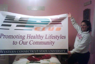
- A design incorporating a bright use of colour
- A design that gives the impression of movement and activity
- A design that will read "HPX Club
The final design is the image you see above. In it, you will see that the typography is sans-serif, italicised coupled with breaks in the letter form to emphasise the feeling of speed and movement, albeit looking more modern and slightly sportier than that of a serif typeface. The dark blue of the "H" is well known throughout the WCSU community as this is the school colour. The "P" and "X" are coloured bright blue and pink to symbolise that the programme is co-ed and both men (paired with the colour blue from birth) and women (paired from birth with pink) can join this club. The word "club" is of a bright orange hue to offset the dark blues while adding to the warmth and brightness of the pink. The finished logo also appears on the banner which adorns any HPX Club events held by current president Valerie Caraluzzi.


No comments:
Post a Comment